Color Schemes Explained
Color is a silent yet powerful communicator. In web design, the color scheme you choose plays a pivotal role in shaping the mood, tone, and overall perception of your website. This article explores the significance of color schemes in web design and how they can be effectively used to evoke the right emotions and convey your brand’s message.

Understanding Color Psychology
At the heart of using color effectively is an understanding of color psychology. Different colors evoke different emotions and associations:
- Red is often associated with energy, passion, and urgency.
- Blue conveys trustworthiness, stability, and professionalism.
- Green is linked to health, growth, and tranquility.
- Yellow represents happiness, optimism, and youthfulness.
- Purple can be seen as luxurious, creative, and mysterious.
- Orange is perceived as friendly, playful, and vibrant.
- Black adds a sense of sophistication, elegance, and modernity.
- White symbolizes simplicity, cleanliness, and minimalism.
Also Read- Strategies for Advanced Website Management and Efficiency
Setting the Mood and Tone
“Setting the Mood and Tone with Color in Web Design” emphasizes how color choices directly influence the mood and tone of a website. Warm hues evoke excitement and energy, while cool tones suggest calmness and professionalism. This section guides designers in selecting color palettes that resonate with a brand’s ethos, creating an immersive and emotive user experience.
Professional and Corporate:

In “Professional and Corporate” web design, the mood and tone are set through a sophisticated palette of neutral tones like navy, deep green, or grayscale, symbolizing formality and respectability. These are often accented with subtle, vibrant colors to add energy without detracting from the overall professional ambiance. The design, focusing on functionality and ease of navigation, reinforces efficiency and reliability. This strategic use of color and design instills confidence, reflecting the stable and established nature of a corporate entity, and fosters a sense of trust and competence in the user.
Energetic and Dynamic
In web design, “Energetic and Dynamic” themes are brought to life through bold and vivid color schemes. Bright oranges, reds, and yellows convey enthusiasm and vitality, creating an invigorating user experience. These colors are often paired with fast-paced animations and interactive elements, mirroring the energy they embody. This approach is ideal for brands aiming to appear youthful, innovative, and action-oriented.
Calm and Tranquil
In web design, creating a “Calm and Tranquil” atmosphere relies on soft, soothing color palettes. Shades of gentle blues, greens, and lavenders, reminiscent of nature, set a peaceful tone. These hues are often complemented with minimalist layouts and smooth transitions, enhancing the serene experience. This approach is perfect for wellness, meditation, and healthcare websites, where a sense of relaxation and calm is paramount.
Also Read- Top 14 AI Websites Video Editors You Should Start Using
Luxurious and Elegant:
For a “Luxurious and Elegant” theme in web design, a palette of deep, rich colors like royal purple, gold, and dark blues sets a sophisticated tone. These colors, often paired with sleek design elements and high-quality imagery, exude opulence and refinement. This approach suits premium brands and services, aiming to convey exclusivity, high-end quality, and a sense of timeless elegance to their audience.
Color Harmony and Contrast

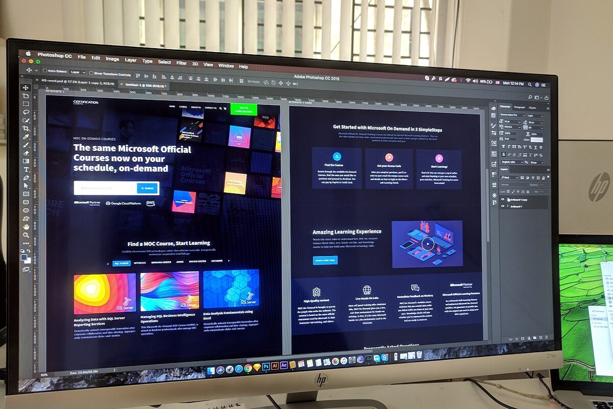
Color harmony refers to the pleasing arrangement of colors that enhances the overall aesthetic and cohesiveness of a website. This section explores various color schemes, such as analogous, complementary, and triadic, providing insights on how to blend hues to achieve a sense of equilibrium. Contrast, on the other hand, is pivotal for readability and user engagement. It’s not just about black versus white; it’s the art of using opposing colors to draw attention to key elements like CTAs and important content.
By balancing harmony with contrast, designers can create websites that are not only beautiful but also functionally superior, catering to an optimal user experience.
Brand Consistency
Your website’s color scheme should align with your brand identity. Consistency in color usage across all brand touchpoints, from your logo to your marketing materials, strengthens brand recognition and reinforces trust with your audience.
Accessibility and Inclusivity
When choosing a color scheme, consider accessibility. Ensure sufficient contrast between text and background colors, especially for users with visual impairments. Tools like WebAIM’s Contrast Checker can help assess the accessibility of your color choices.
The Role of Color in User Experience
Colors not only affect the look of a website but also influence user behavior and interaction. For example:
Call to Action Buttons: Bright colors like red or orange can draw attention and encourage clicks.
Navigation: Neutral tones can keep your navigation clear and unobtrusive, guiding users without overwhelming them.
Alerts and Warnings: Red for errors or important warnings, green for successful actions, and yellow for cautionary notes.
Using Color to Guide and Inform
Colors can also be used to guide users through a website and inform their interactions. Different colors can delineate different sections, highlight key information, or lead the user’s eye to the next action step.
Trends and Innovations in Color Schemes in 2024
This year, web design is witnessing a bold interplay of pastels and neons, creating a vibrant yet harmonious digital experience. Muted greens and blues, symbolizing tranquility and trust, are being paired with energetic pinks and purples, reflecting a blend of calmness and creativity. Earthy tones, inspired by nature, are making a strong comeback, promoting sustainability and grounding in an increasingly digital world.
These color trends are not just aesthetic choices; they profoundly impact user experience and brand perception. The article provides actionable insights on incorporating these palettes, emphasizing the need for balance and contrast to ensure readability and accessibility. It also explores the psychological impact of these color choices, helping designers create more empathetic and user-centered websites. With real-world examples from leading brands, the post is a treasure trove for designers looking to stay ahead in the ever-evolving world of web design.
Conclusion
The right color scheme in web design is more than just an aesthetic choice; it’s a strategic tool that sets the mood and tone of your website, aligns with your brand, and influences user experience and behavior. By thoughtfully selecting and applying color, you can create a website that not only looks great but also resonates emotionally with your audience, ultimately enhancing engagement and effectiveness.


