


 Header Through Cloudflare")


In this guide, we will get to know how to create beautiful box shadows in HTML and CSS.
Box shadow property is magical. It refers to adding shadow to an element and is sometimes also known as “drop shadows”. Whether you are designing a price list card or products or a product listing card for your website, Box shadow can help you create a very aesthetic effect. But it should be used carefully.
The Property of box shadow can either completely beautify the look or completely make it look trashy. Undoubtedly, while designing a card using HTML, box-shadow plays a wonderful role in enhancing the overall effect of the card on the customers. Using it, the card looks more appealing and impactful.
Also Read: How To Use Hashtags For Branding And Promotions
Why Box Shadows should be used?
- Box shadow effect also creates an illusion that the element( on which the effect is applied) is floating over the background.
- It is very crucial to draw the attention of viewers.
- When you apply this effect to a particular element or box, it adds depth to it.
- It is also very essential to create a 3D effect.
- It is creating an illusion that the boxes are popping out of the screen.
Also Read: What Is Linktree And How To Use It For SEO?
Let Us Learn How to create Beautiful Box Shadows in HTML and CSS
In this guide, we will know how to create a simple and dull shadow box into a vibrant one. Firstly, let us learn some basics:
Basic syntax for Box Shadow :
box-shadow: 3px 4px 5px 6px rgba(20,20,20,0.4);
In the above code syntax, there are 5 elements. Let us understand what they mean separately.
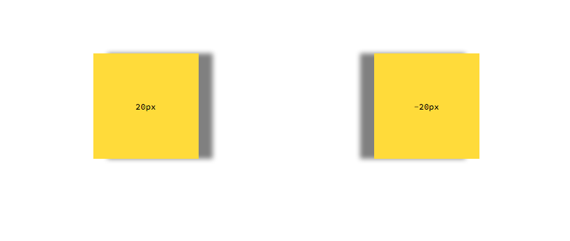
1.3px: In the above example of coding syntax, 3px represents Horizontal Offset. It represents the horizontal extent of the box shadow. If you want the shadow to extend more to the right or left, then the value should be positive or negative respectively.
2. 4px: 4px represents vertical offset in the above example. It shows the vertical extent of the shadow. The shadow will be more extended to the upward or downward direction if the values are negative or positive respectively.
3. 5px: In the above example, 5px determines the blurriness of the shadow. Lower the radius, the lesser blur will be the shadow.
4. 6px: 6px determines the expansiveness of the shadow. It determines the extent of shadow’s spread in all directions.
5. rgba(20,20,20,0.4): It determines the color of the shadow. If the color of the shadow is not indicated, then it will automatically apply the default color. Different color codes can be used(Hex, RGB, or HSL) depending upon the context.
Hence, the syntax is :
box-shadow: [horizontal offset] [vertical offset] [blur radius] [optional spread radius] [color];
Look at both these Cards.
- Due to the application of Box Shadow property, the boxes seem elevated from the background. If you want to draw the attention of the customers to your product cards, then adding box shadow is a great option.
- When you use box shadows effectively for displaying the products on your website, your products become noticeable to viewers.
Semi-transparent color like rgba(0, 0, 0, 0.4) is most commonly used. It gives a decent visual effect and also provides the illusion of a real shadow. It looks attractive and appealing.
Code Snippet For Above given example:
Html: <section class=”area”>
<div></div>
<div></div>
</section>
CSS:
body {
height: 100vh;
margin: 0;
display: grid;
place-items: center;
}
div {
width: 100px;
height: 100px;
}
.area {
display: grid;
gap: 3rem;
grid-template-columns: repeat(3, 1fr);
}
div:nth-child(1) {
box-shadow: 0.5rem 0.5rem black, -0.5rem -0.5rem #ccc;
}
div:nth-child(2) {
box-shadow: 0 0 5px 5px red;
}
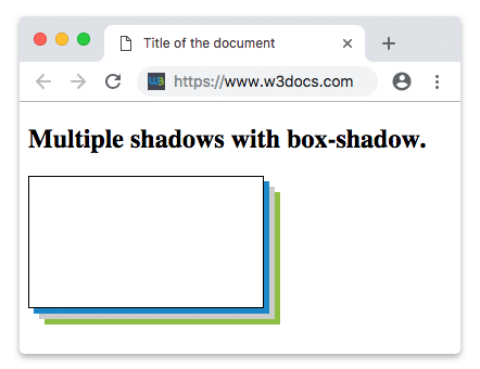
Layering:
Multiple Layers to Box Shadow
To make the box-shadow effect more realistic, layering is another good method. In this method, different layers of shadows are placed consecutively. Just placing the layers at the top of one another is not enough. To Give a life-like look, there must be a slight difference between the shadow layers.
Multiple layers of box-shadow can also be added using commas. Adding multiple layers of shadow to an element is a piece of cake. You just simply need to separate different box shadows using commas. You can add as many box shadow layers as you want but a combination of 5 layers is considered more appealing.
For an instance:
box-shadow: inset 10px 10px 10px #000000,
inset -10px -10px 10px red;
- In this example, both the box shadows will be applied to the same element but their positions will be different. Hence. this property can be used to create, multiple borders.
- Using this effect, you can apply several box shadows to the same element as per your liking and create wonderful, illusional, fancy, and alluring effects.
Playing With Colors
We can add colors by using the rgba() syntax.
Colors play a very significant role when it comes to creating visual impact. The effect of colors is so powerful. So, using colors wisely in Box shadows is also important. It is a very subjective phenomenon and solely depends on the theme of your website.
Many times, Simple gray shadow goes best with White background and looks more decent than the other vibrant colors.
For an example:
Code Snippet for this instance:
Html:
<div class=”container”>
<div class=”card-2″></div>
</div>
CSS:
.container {
height: 100vh;
width: 100vw;
display: flex;
flex-direction: row;
align-items: center;
justify-content: center;
}
.card-2 {
height: 200px;
width: 200px;
border-radius: 5px;
border: 1px solid #ccc;
box-shadow: rgba(0, 0, 0, 0.4) -5px 5px, rgba(0, 0, 0, 0.3) -10px 10px, rgba(0, 46, 170, 0.2) -15px 15px, rgba(0, 0, 0, 0.1) -10px 10px;
}
This is a very basic Box Shadow. You can add multiple layers and colors according to your liking.
Also Read: How to Find What all Tools and Plug-ins a website is using
Now, Consider the Following example:
The Code Snippet for above example is given below:
- Html: <div class=”container”>
<div class=”card”></div>
</div> - CSS :
.container {
height: 100vh;
width: 100vw;
display: flex;
flex-direction: row;
align-items: center;
justify-content: center;
background-color: rgb(100 113 133);
}
.card {
height: 200px;
width: 200px;
border-radius: 5px;
background: white;
box-shadow: rgba(254, 205, 211, 0.1) 0px 4px 16px, rgba(254,205,211,0.1) 0px 8px 24px, rgba(254,205,211, 0.1) 0px 16px 56px;
}
( It may not be the be
st example of Box Shadow but it is just a way to explain a concept)
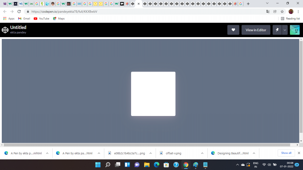
- Here, the box shadow is the lighter shade behind the card which can be easily noticed.
- Additionally, their layers of the box shadow have been added in this instance.
- Also, to create a more powerful visual impact, experiment with different colors and find out what works best for your website.
- Pro Tip: The Color should justify the theme of your website. (In case you are designing the card for your website)
Colored background
When you choose to apply a background color, It is usually a better idea to have colored shadows of a lighter shade of the background color that is being used.
Using Inner Shadows
In the above example, the direction of the Box Shadow was outside the card. But. what if we want to apply this effect inside of the Holding container?
You can do this effortlessly by using the ‘Inset’ box shadow. Using this you can apply the layers of box shadow within the holding container.
It will be a different style. Now the matter is which style should we prefer? Here, we need to understand that both styles have their own significance. You can use any of these styles or both depending on the context.
However, you need to consider one thing. The application part should be effective and the overall look of effect should be impactful.
It will be helpful for any website. Now, how do we achieve that? It requires a little bit of experimenting with the colors, Shadows, and layers.
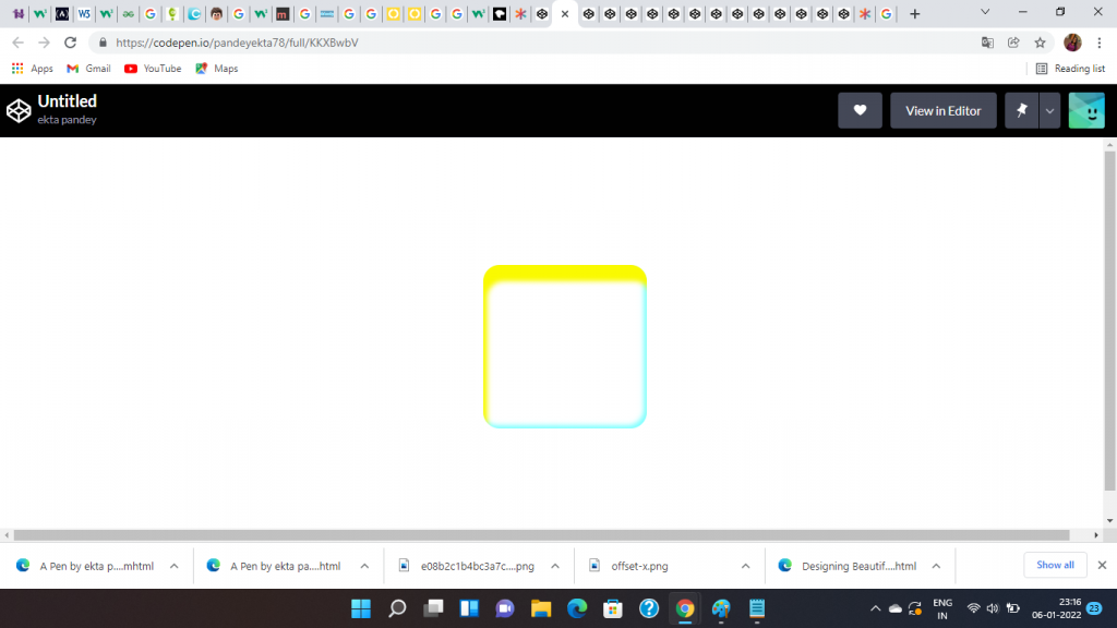
THE CODE FOR THE ABOVE BOX SHADOW IS:
- Box Shadow: box-shadow: rgb(250, 250, 0) 5px 20px 6px 0px inset, rgba(0, 255, 255, 0.5) -3px -3px 6px 1px inset;
}
The usage of Inset indicates that the Shadow will be cast within/inwards the holding container or card.
You can effectively use inner shadows on your Applications, websites, etc. to display important information like current offers or a discount.
Examples of Box Shadows:
#1.
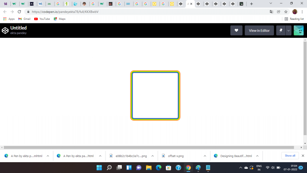
Coding Snippet:
Html: <div class=”container”>
<div class=”card”></div>
</div>
CSS:
.container {
height: 100vh;
width: 100vw;
display: flex;
flex-direction: row;
align-items: center;
justify-content: center;
}
.card {
height: 200px;
width: 200px;
border-radius: 5px;
background: white;
box-shadow: rgb(85, 91, 255) 0px 0px 0px 3px, rgb(31, 193, 27) 0px 0px 0px 6px,
rgb(255, 217, 19) 0px 0px 0px 9px, rgb(255, 156, 85) 0px 0px 0px 12px;
#2
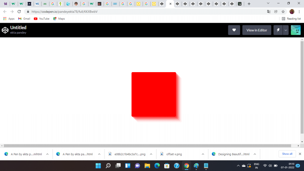
Code:
<div class=”container”>
<div class=”card”></div>
</div>
.container {
height: 100vh;
width: 100vw;
display: flex;
flex-direction: row;
align-items: center;
justify-content: center;
}
.card {
height: 200px;
width: 200px;
border-radius: 5px;
background: Red;
box-shadow: rgba(250, 0, 0, 0.4) 5px 5px, rgba(250, 0, 0, 0.3) 10px 10px, rgba(250, 0, 0, 0.2) 15px 15px, rgba(250, 0, 0, 0.1) 20px 20px, rgba(250, 0, 0, 0.05) 25px 25px;
Conclusion:
It takes time to master the art of creating perfect Box Shadows. Moreover, knowledge and constant experiment are also a pre-requisite. By tweaking values and colors, you can create beautiful Box Shadows in Html and CSS. This article provides you with an insight into how to create beautiful box shadows in Html and CSS.


